
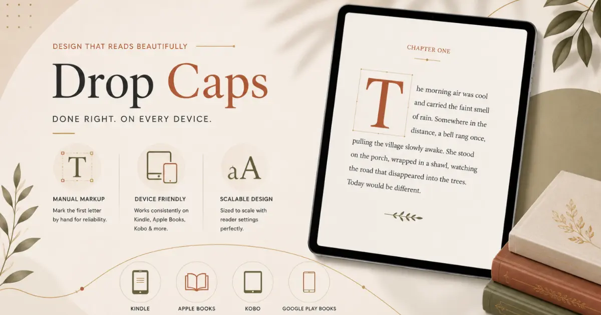
A drop cap looks effortless in a finished book. It’s one oversized letter anchoring the first paragraph of a chapter, quietly signaling “something new starts here.” In a printed book, that effect is simple to set up, and it stays put. In an eBook, that same design choice can quietly break, spilling into the next line, ignoring your chosen font, or disappearing entirely, depending on which device someone opens the file on.
That’s the part most people don’t expect. An EPUB isn’t a fixed page like a PDF. It’s a flexible file that reshapes itself depending on the screen, the font size the reader has chosen, and the app or device rendering it. A drop cap that looks perfect on your laptop can look broken on a Kindle. Getting it right means understanding not just what a drop cap is, but where it tends to fall apart, and how to build it so it doesn’t.
What a Drop Cap Actually Needs
A drop cap is a single large capital letter, usually the height of two to four normal lines, that the rest of the paragraph wraps around. To make that work reliably in an eBook, three things need to happen together:
- Only the very first letter of the paragraph gets enlarged, not the whole word.
- That letter needs to sit into the paragraph, with the text wrapping around it.
- The sizing has to scale properly no matter what font size the reader has selected on their device.
There are two ways to build this. One is the “textbook” method, which most design software offers automatically. The other is the method eBook formatting professionals actually rely on, because it holds up across more devices. It’s worth knowing the difference before you pick one.
The Textbook Method & Why It Isn’t Reliable
Most formatting tools and a lot of online tutorials will tell you to apply an automatic “first letter” styling rule to your opening paragraph. In theory, the software detects the first letter on its own and enlarges it, and you never have to touch the letter directly.
In practice, this works well on newer apps like Apple Books and most tablets. Where it falls apart is Kindle. The automatic detection is inconsistent there. The enlarged letter sometimes doesn’t wrap correctly, sometimes overlaps the line beneath it, or doesn’t apply at all. Since Kindle still makes up a large share of how people read eBooks, “works everywhere except Kindle” isn’t a safe outcome.
The Reliable Method Is Marking the Letter by Hand
The technique that holds up consistently across Kindle, Apple Books, Kobo, and Google Play Books is a little more manual, but far more dependable. Instead of asking the software to guess which letter to enlarge, the formatter marks that specific letter directly and applies the enlarged styling only to it.
Think of it like highlighting one word in a document and only then making it bold versus telling the software “automatically bold whatever the first word happens to be” and hoping it guesses correctly every time. The first approach is a little more hands-on. It’s also the one that behaves the same way on every device, because it isn’t relying on each app to correctly detect and interpret something on its own.
For a full manuscript, this means going through each chapter opening and marking that first letter individually. For most books, that’s a few dozen spots, not hundreds. It’s a small, one-time pass, and it’s the main reason professionally formatted eBooks tend to render drop caps consistently while self-formatted ones often don’t.
Sizing That Scales With the Reader’s Settings
One of the most common drop cap mistakes has nothing to do with which method you use. It’s setting the letter’s size as a fixed measurement instead of a relative one.
EBooks are built to reflow. Readers routinely increase or decrease the text size on their device, and everything on the page is supposed to resize along with it. If a drop cap is sized as a fixed measurement, it stays exactly that size even when the reader bumps their font size up two notches. So, a letter that looked proportionate at first can end up looking too small, too large, or oddly out of balance with the paragraph around it.
The fix is to size the drop cap relative to the surrounding text, the same way a heading might always be styled at “twice the size of body text” rather than “always 40 pixels,” so it scales automatically no matter what size the reader has chosen. This one adjustment prevents more broken-looking drop caps than anything else on this list.
When a Chapter Opens With Dialogue
If a chapter or scene opens with a line of dialogue, the very first character isn’t a letter; it’s a quotation mark. Enlarge that character the same way you’d enlarge a letter, and you end up with a giant floating quotation mark sitting oddly next to a normal-sized first letter, which reads as a formatting error rather than a design choice.
The cleanest fix is to include the quotation mark as part of the same styled unit as the letter beside it, sized down slightly so the two sit together naturally, rather than enlarging the quotation mark to the full drop cap size on its own. Whichever approach you choose, the important part is consistency. Pick one way of handling opening quotation marks and apply it the same way at every chapter opening, so the formatting doesn’t look like three different decisions made across one book.
If You’re Using a Decorative Font
Some drop caps use a more decorative or ornamental typeface than the rest of the book. It’s a nice touch, but it comes with a requirement most people miss. The font has to be built directly into the eBook file itself. Unlike a printed book, where the font is simply printed onto the page, an eBook has to carry the font along with it, or the reader’s device will quietly substitute its own default font instead.
This substitution doesn’t throw an error or a warning. The file still opens fine — it just quietly doesn’t look like what you designed. If you’re using a purchased or downloaded font for a drop cap, it’s also worth checking that the license specifically permits “eBook” or “embedding” use, since many font licenses cover printing and viewing but not being packaged inside a file that gets copied onto someone else’s device.
Test Before You Publish
Drop caps are worth checking on more than one device before calling a file finished, because they’re one of the few elements that can look completely different depending on where it’s opened. At minimum:
- Preview the file using Amazon’s free Kindle Previewer tool, which catches most Kindle-specific rendering issues before a real reader ever sees them.
- Open it in Apple’s Books app or a similar reader, since it tends to handle formatting the most accurately.
- Use a general-purpose eBook viewer like Calibre for a quick sanity check while you’re still editing.
Check every chapter opening individually rather than assuming the first one represents all of them. A drop cap that looks fine on a paragraph starting with “T” can behave differently on one starting with a wider letter, or one that opens with dialogue. Also test at a couple of different font-size settings on an actual device, since that’s exactly where sizing mistakes show up.
Conclusion
Skip the automatic “first letter” styling, mark the opening letter by hand instead, size it relative to the surrounding text rather than as a fixed measurement, and make sure any custom font is properly built into the file. That combination is what holds up across Kindle, Apple Books, Kobo, and Google Play Books without needing a different fix for each one.
It’s a small detail. But it’s also the first thing a reader’s eye lands on when a new chapter begins, worth the extra care to get right.
FAQ’s
A drop cap is an enlarged first letter at the beginning of a chapter or section, extending across multiple lines to create a polished, editorial look.
Not always. Different eReaders and apps interpret EPUB and CSS styling differently, so drop caps should be created using flexible, standards-compliant formatting.
Usually, no. CSS-based drop caps are generally more flexible and accessible than image-based letters, especially in reflowable eBooks.
Differences in fonts, screen sizes, reading settings, and CSS support can affect how a drop cap appears. Testing across multiple readers helps identify compatibility issues.
Use simple CSS, web-safe or embedded fonts where appropriate, avoid excessive positioning, and test the EPUB in Kindle Previewer and other major e-reading environments before publishing.